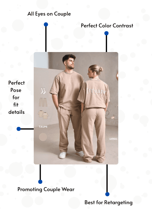
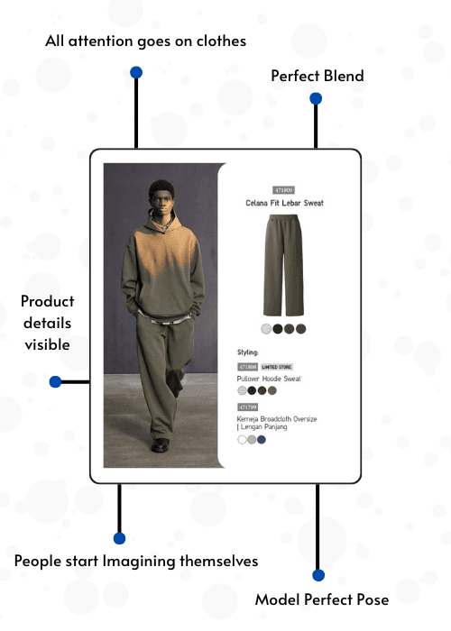
3 Examples | 3 Quizzes | See Every Mistake Clearly
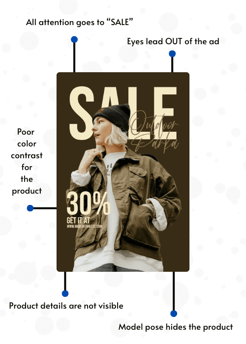
What’s Wrong with this ad:
👉 The jacket becomes secondary, which is bad for apparel
👉 The product blends into the background
👉 Fabric texture not clear
👉 No clear front view
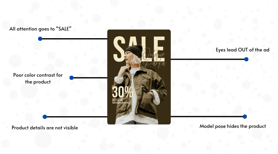
3 Examples | 3 Quizzes | See Every Mistake Clearly
👉 The jacket becomes secondary, which is bad for apparel
👉 The product blends into the background
👉 Fabric texture not clear
👉 No clear front view
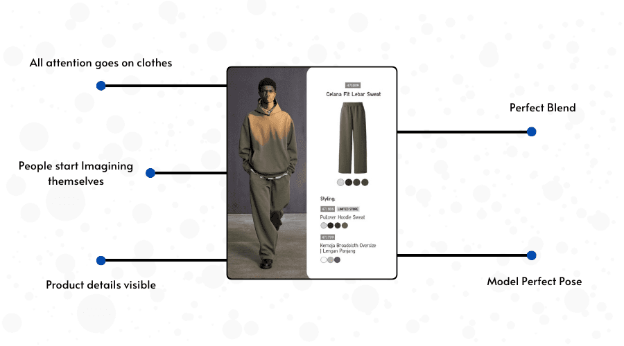
3 Examples | 3 Quizzes | See Every Mistake Clearly
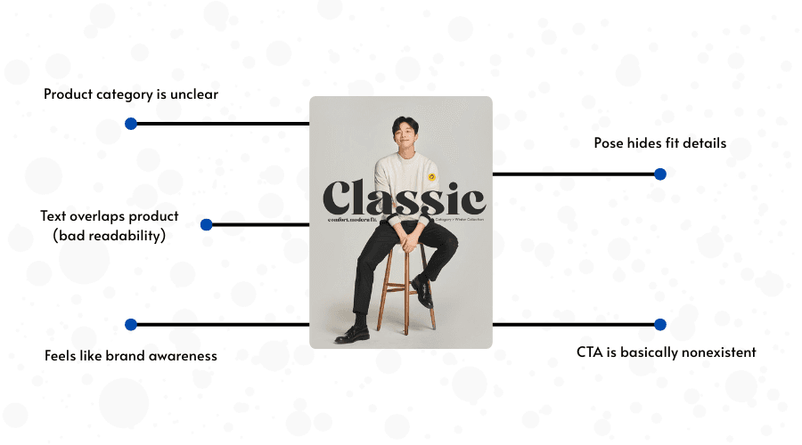
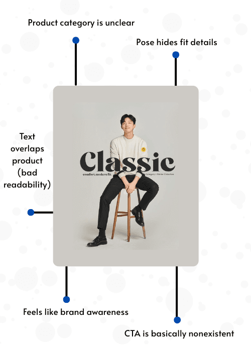
👉 “Classic” is huge and sits on top of the model
👉 Is this about Pants? | Sweater? | Shoes? | Whole outfit?
👉 Sitting pose compresses fabric
👉 Hierarchy confusion
Current priority:
Big “Classic” text | Face | Random icons | Brand name | Tiny product details
Correct should be:
Product | Fit / silhouette | Brand | Supporting text